Artifact - ENGR 231 Poster

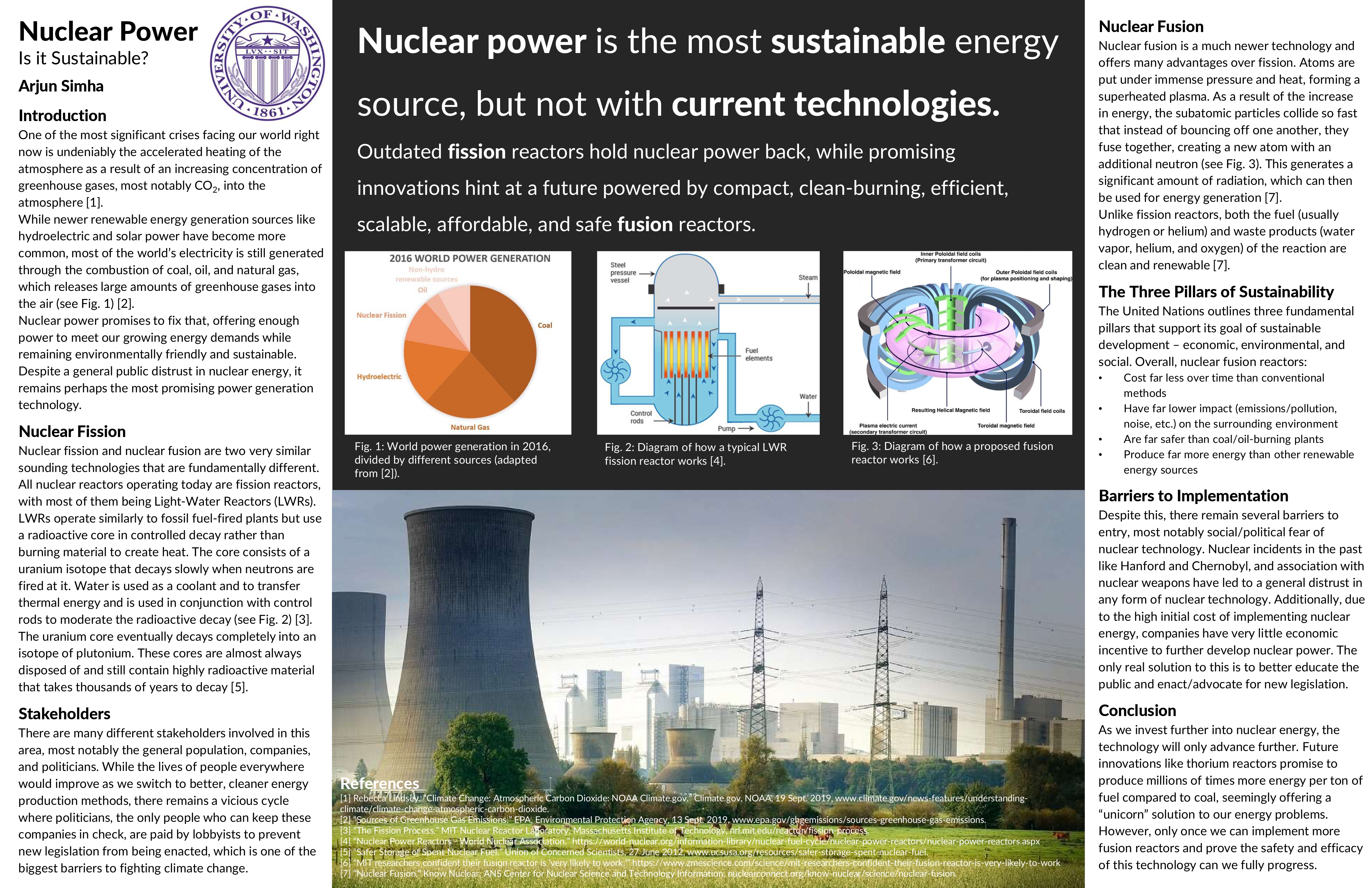
Though there were many different assignments that we completed in ENGR 231, the sustainability poster was perhaps my favorite. Academic posters are infamously badly designed and hard to read. They often look like a bunch of words vomited onto a page, as researchers try to fit as much information as they can into a relatively small space. However, this often has the effect of making the information on the poster much harder to digest and understand to the average viewer.
For this project, we were tasked with designing a poster in the so-called "better poster" format, which aims to fix many of the issues that plague conventional posters. In this format, the figures and main finding are front and center in the middle of the poster, while the walls of text are reduced down and placed on the side. Thus, at a quick glance, the viewer can quickly understand the main point. Then, if they desire additional information, the sides of the poster serve as appendices that they can refer to.
Though my experience with academic posters is somewhat limited, this assignment was a great exercise in understanding how to improve technical communication. In the real world, communication is key, and teaching engineers like myself how to improve their communication skills from a young age is very important.